Why J&J Doughnuts?
The spot for an after school donut fix and early morning coffee grab.
J&J Doughnuts for the longest time was the spot to go after school for a donut fix with your friends. You would come in take a photo and hang it not the wall that was filled with years and years of after school memories. Since the owners sold and moved J&J Doughnuts has never been the same and is no longer anyones spot.
JUEST EAT THE DONUT
| J&J DOUGHNUTS & COFFEE |
JUEST EAT THE DONUT | J&J DOUGHNUTS & COFFEE |
J&J Doughnuts and Coffee Research
-
J&J Doughnuts and Coffee is located on a street that has 3 schools within a 5 miles radius, making it a hot spot after school. With the business being located on a Main Street that also happens to be inute of the students walking home, students happen to be the number one custome for this business.
-
J&J Dougtnuts and Coffee used to be the stop for all after school students walking home. Pulling form this one glory, J*J Doughnuts needs to be vibrant, inviting yet professional and able to appealing to parents and adults stopping by after dropping off their kids at school.
-
The idea behind the e visual identity was to provide custom typography and that looked like it had been around for a while but still made people want to come in and enjoy a cup of coffee and a donut.
Since J&J sells donuts and coffee ideating a logo that incorporated both concepts and uniquely utilized the logo word mark.
LOGO BREAKDOWN
LOGO BREAKDOWN
-
When drafting the finalized logo marks and thinking about color schemes, one thing was clear… if this business is going to communicate to a younger demographic it has to be fresh, it has to be funky, and it has to be eye-catching.
The location of this donut shop is in a valley that is know for its California Poppies and therefore was a definite yes for color selection. Since the goal was to come up with funky, choosing a green that was less than ordinary suited a brand that needed to feel less than ordinary. As far the muted pink color, finding a color that was suitable for sprinkles yet also bold enough to catch the eye was a bonus that came into the color palette.
-
I know what you’re thinking…a donut in a coffee mug, safe…but hear me out.
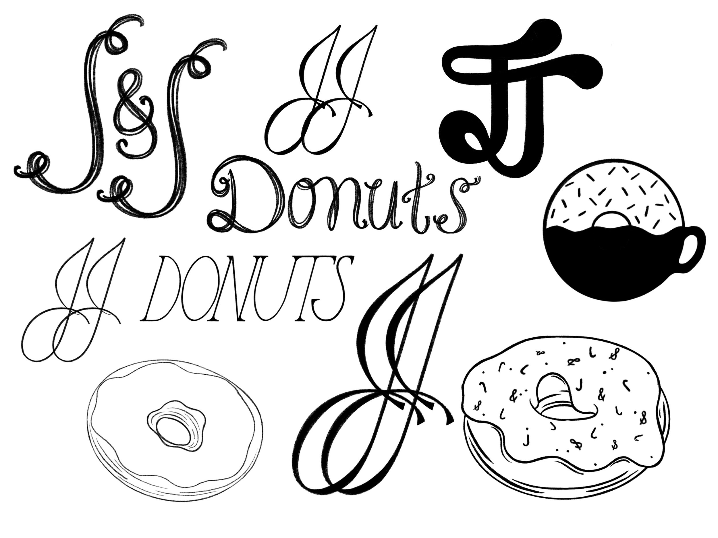
When coming up with a logo concept for this business several ideas were ran through, everything from a donut person, to a more ambiguous icon that related to the environment, a snake, and even a tongue…yes a tongue. What I found when designing this concept was that since this was going to be something meant for teens to hang at it needed to be easily understood and actually communicated to the parents. Designing something that was ambiguous with a giant tongue or even a snake was going to put parents minds at ease nor was it going to invite young teens in for a donut.
When designing the word mark, giving the appeal of fresh yet “chill” was a necessity. So clear crisp letterforms with slight bumps and rounded corners helps to make it inviting and of quality.
Logo Variations & Submarks
Secondary Mark
By using the same word mark as used th primary mark, J&J now has a secondary mark that can be used in simpler setting that can still be attributed with J&J Donuts and Coffee.
In this combination mark I used both the word mark and brand mark used in the primary logo to bring in the same familiarity. By splitting up the letterforms from the word mark and placing the brand mark in a square lock-up I was able to achieve a third sub-mark that cold be used for various collateral materials.
Right below are the common brand elements used throughout the brand as patterns, icons, and other decorative purposes for collateral.
Sub-mark & Icons
During the sketching process one of the concept I entertained was the idea of this simple almost retro donut character. Since the main audience for this business was going to be teens, I figured having a fun element that could almost act as the mascot for J&J Donuts & Coffee.
Being located in the suburbs of semi-small town, having something that shows town pride and repping where your from is a not uncommon. So by adding a typographically interesting version of the town name is a fun of incorporating town pride as well as providing yet another element for the brand to use on collateral and in store visual elements.
Mascot & Town Pride
With the funkiness already surrounding this visual identity, adding a few fun patterns that could used for boxes, to-go bags, napkins and even beverage cups is a fun add that contributes even more the aesthetic that the donut shop holds.
Patterns
Collateral


