Happy Hearts Preliminary Research
-
Provide client with the proper deliverables that suit the client’s needs for a long term use.
Client is just starting up a new business and is looking for assistance in producing successful marketing materials such as a logo, business card and a car magnet. They would also like the brand to communicate a hands-on, Montessori way of learning that is not overstimulating and easy to grasp from a newcomers perspective.
Also looking for assistance in solidifying a name that is unique enough to make the business stand out but not too abstract that potential parents don't understand what her services are.
-
“Montessori, Inviting, and easy-to-take-in” were words that the client used when describing how they want their business to communicate. The client also recognized that the “Montessori” style is not commonly known so it needs to be subtle but communicated through more vibrant colors rather than earth tones.
-
Ideate a name and brand that accurately describes the client’s business.
Design a brand and collateral materials that follow suit with a Montessori, friendly, and hand-on style.
Provide a name, logo business card, and car magnet for marketing.
Deliver deigns and files by mid to late April in time for the end of school year and beginning of summer.
Target Audience
Bilingual:
2021 Census of Lancaster and Palmdale, California
Montessori Style:
Upon doing research it has been found that 68% of Montessori preschool students were evidently more readily prepared for highschool education unlike the 56% of students taught in a traditional control style.
68%
43%
Studies have found that using the Montessori style in education provides further advancement in social cognition by up to 43%. Montessori students have 25% higher level of reasoning then control style children.
HAPPINESS FROM THE START......
HAPPINESS FROM THE START......
Colors Choices.
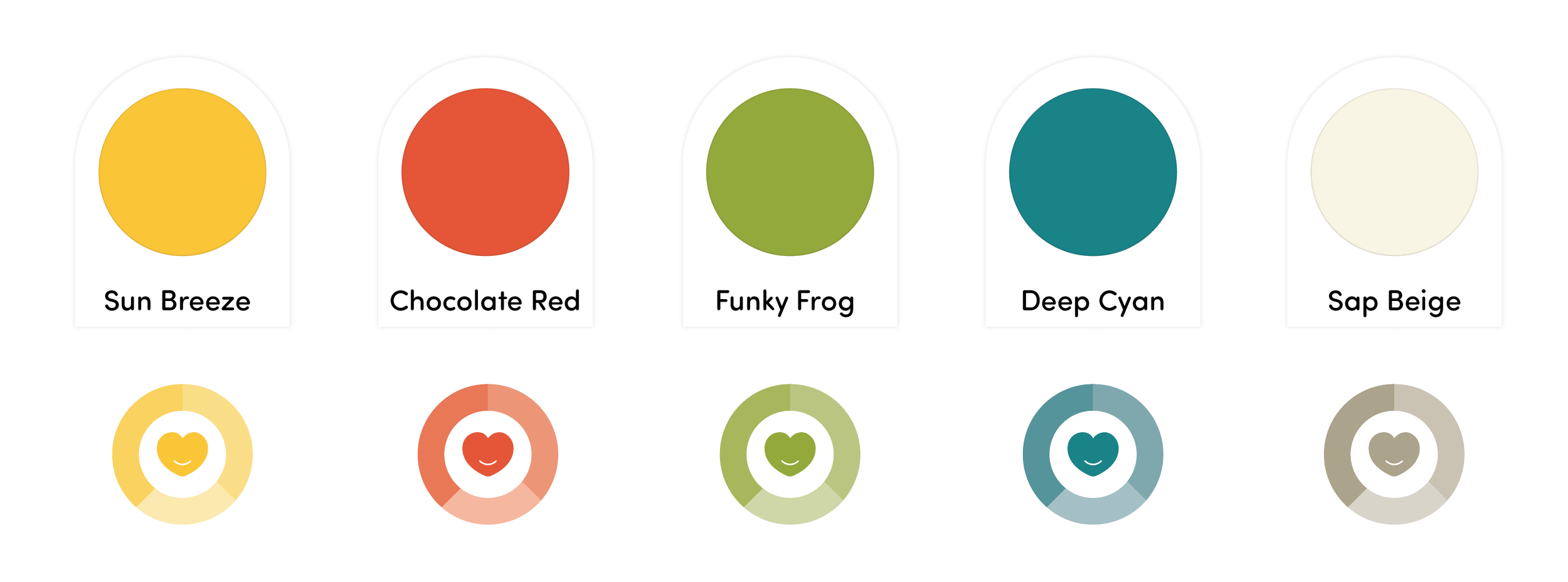
When drafting the finalized logo mark and thinking about color schemes, one thing was clear… if this business is going to communicate to an audience of young parents, Montessori style but unique enough that color palettes of sage green, neutral browns and pastels were avoided.
The client wanted to communicate a Montessori and vocalized her appeal of the neutral, organic Montessori styles as it seemed calming and inviting. Although the client liked this aesthetic she also wanted to have color in her branding and wanted a vibrant palette. Because of this I went will primary colors that were slightly muted in order to avoid tackiness but maintain the integrity of the vibrant colors.
Concept Decision.
During the sketching process and figuring out what this logo needed to include and look like, I research several different kids brands, services brands and logo marks searching for something that fell into place with the goals the client was requesting. Since the logo needed to be clear and communicative of what the services are, I went a route that was literal and obvious.
By choosing a heart icon for the brand I avoided an abstract concept that new parents may not understand right away. The heart icon that I designed is a communicative of the name when look at it, allowing it to be easily identified and easily remembered if the icon were to be seen on its own.
The client also requested a playful script font for the brand name but also liked the look of a serif font because of the professional voice serif fonts typically have. In order to achieve a level of sophistication and playfulness that the client was requisition, I decided that a slab serif type would still give the brand a level of sophistication but also not so stuffy that the child aspect of the brand was cancelled out. Upon playing with several different handwritten script concepts, I was not satisfied with the lack of playful so I began to work on a combination of handwritten script and slab serif and found a happy blend by simply changing the first h is happy hearts to a playful script letterform. This playful h letterform helps to provide more brand assets to the brand as a stand alone icon.
Logo Variations & Icons
Logo Variations & Icons
Primary Mark
Using a hand-drawn slab serif font and script font, Happy Hearts now has a playful yet sophisticated primary mark.
Secondary Mark
During preliminary sketching I found that the heart and words include dint he primary logo work together in multiple way. By placing the word mark on the inside of the heart brand mark a secondary logo was able to be created.
Note: The client decided to only move forward with a primary logo mark at this time, anything outside of the primary logo, business card, and car magnet are not officially a part of the brand but are concept pieces to expand the project upon.
Icons
To provide more assets that are fun and inviting to the brand, hand-drawn “stick figures”


