A non-clinical art therapist that uses art to structure, communicate and guide others.
What is Day Lily Creations?
an avenue to understanding ourselves and our world more deeply.
an avenue to understanding ourselves and our world more deeply.
Day Lily Creations Research
-
Day Lily Creations is tailored primarily towards elementary students through art lessons.
Although primarily tailored towards a younger demographic, Day Lilly wants to shift towards a corporate demographic that is more adult based to offer corporate and nonclinical classes as an art therapy session.
-
The owner of Day Lily Creations has an artistic approach to her branding and wanted to ensure that her brand communicated a timeless design that utilized colors in unexpecting pops. The founder also believes that beauty is an abiding truth rather than a surface level facade.
With these expectations and preferences for her brand, it was vital that color and timeless beauty was accurately communicated.
-
When speaking with the client it was clear she wanted an embellished and not so modern logo concept. She expressed not liking the minimalism of modern logos and wanted something that portrayed timeless beauty.
After many meetings and communicating a modern yet embellished logo came about and was decided upon.
primary logo
primary logo
-
The colors for the brand were clearly communicated from the client, she wanted soothing earth tones but the basic Onnes that everyone else uses. She also wanted pops of color given her philosophy about beauty and color.
To do so we provided the client with 3 different greens, two blues, and a coral orange and coral pink to add some pop into her brand.
-
A lot of what the client was wanting for her band was opposite of what everyone else is doing with the brand right now, including her logo. She wanted a logo that was embellished and that didn't dance around what her services might be.
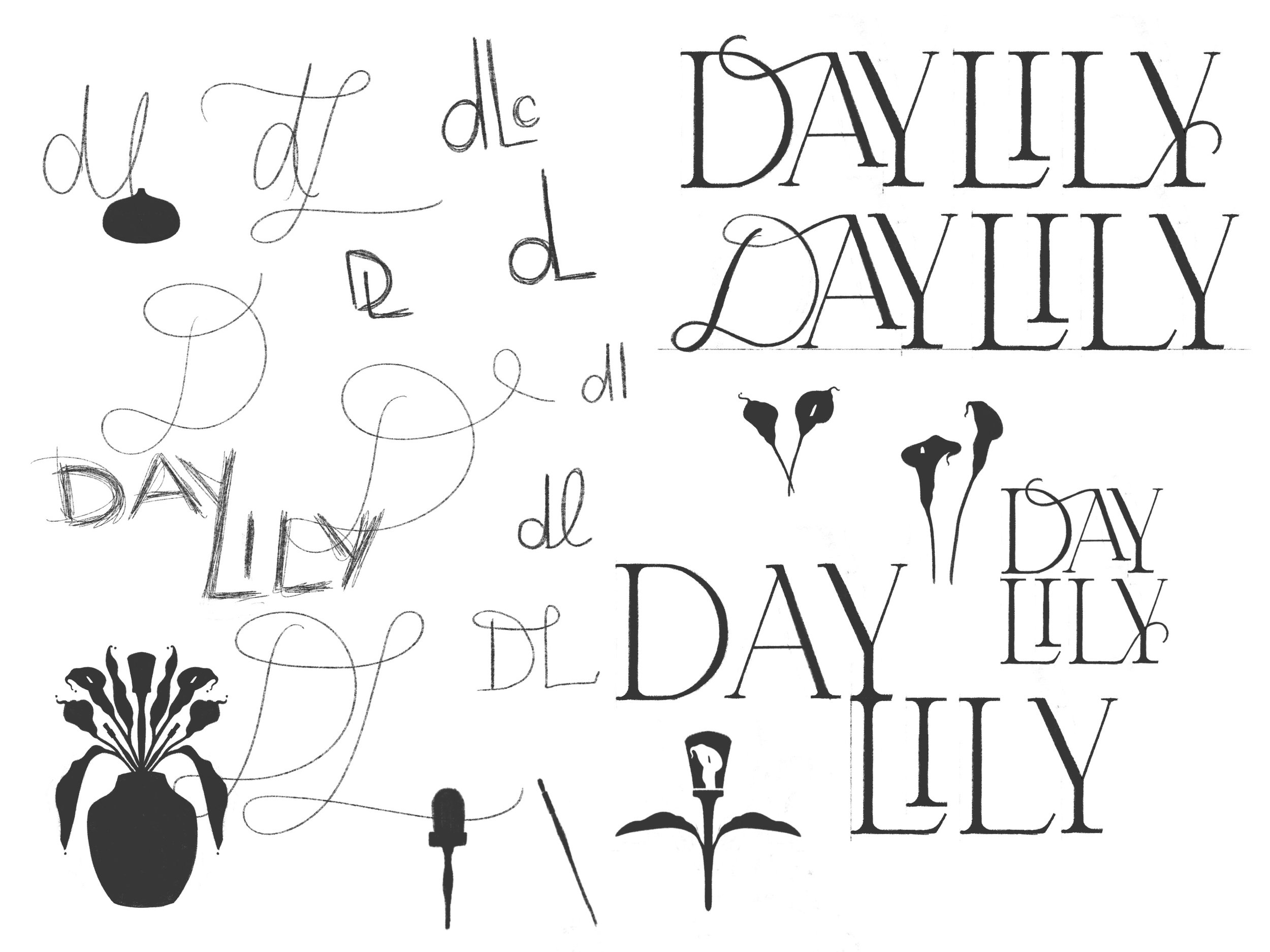
With this passionate stance of no strong minimalism, we started the concept of this logo off with a very full bouquet of lilies. After meetings and testing, it was clear a heavily pack logo was not going to be timeless or practical.
We simplified the concept and came up with a design what used a single leaf, lilies and brush to give an obvious communication of the brand but keep some embellishment.
Logo Variations & Submarks
Secondary Mark
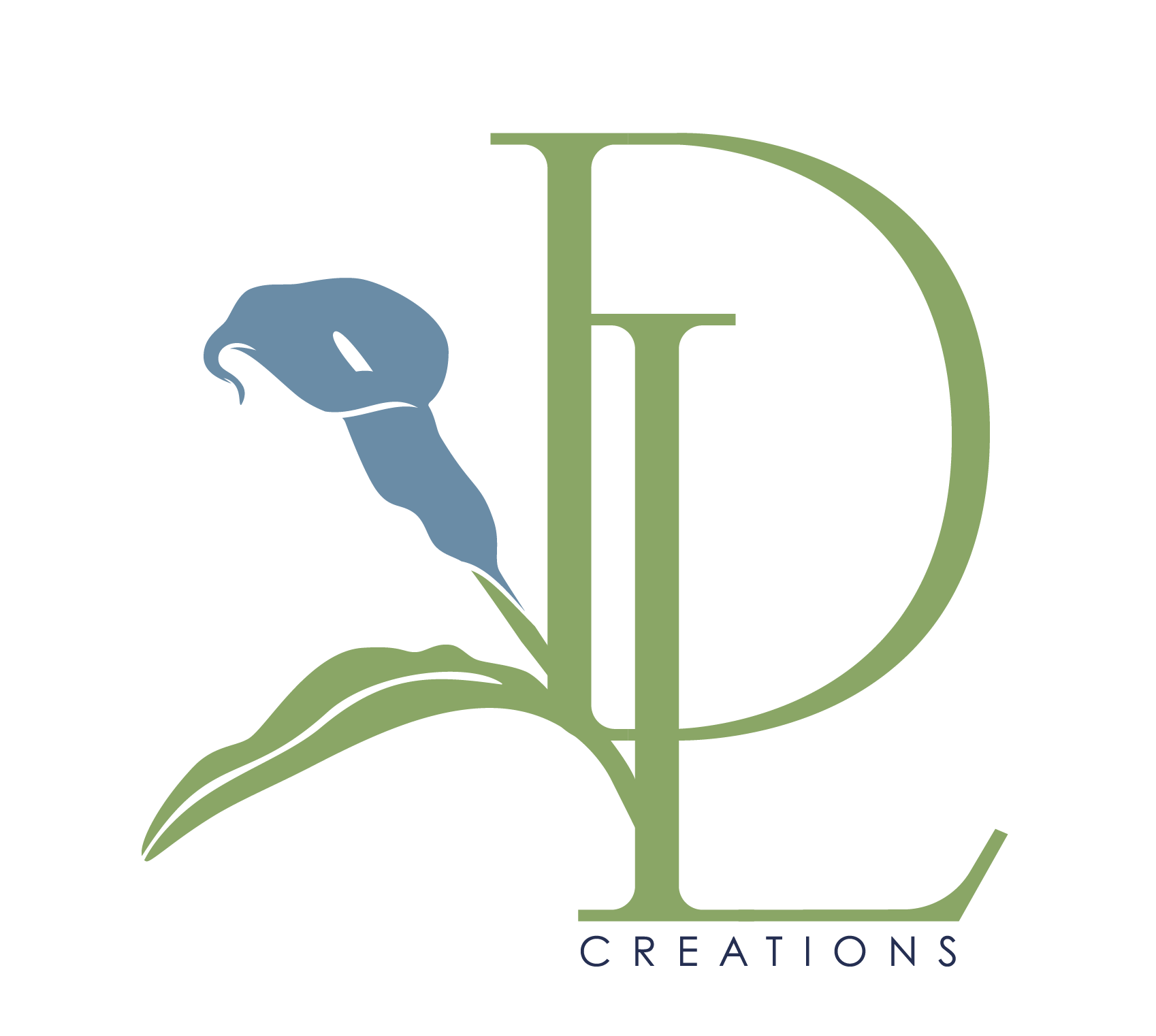
The lock-up of this secondary mark was design to bring more diverse options to the band when it came down to merchandise and collateral materials. By rearranging the elements used in the primary log and locking the custom serif initials together, we were able to create a sleek and artistic design that cohesively blended with the brand.
Keeping a very similar look to the primary logo, this horizontal sub-mark creates a simplified log to the primary logo as well as allow for a another option to use for merchandise and Right below are the common brand elements used throughout the brand as patterns, icons, and other decorative purposes for collateral.
The pother submarket are very useful throughout the rest of the brand as icons on the website and purposes such as business cards, stickers and decals.
Sub-mark & Icons
Collateral


